An Author’s Profile Picture is Worth a Thousand Words
 Roxyanne Young is a children’s author and photographer with extensive knowledge about websites. Today she shares some important information for authors about their profile photos. Authors need photos for book covers, conference programs, flyers, and social media. If you are like me and hate to have your picture taken, this award-winning photographer has some very practical tips so you can put your best face forward.
If an image is worth a thousand words, what is your author portrait saying about you?
Images intended for book jackets should be close-up shots centered on the author’s face and should avoid distracting background clutter, other people, etc. These images are usually about one and one-half inches wide by two inches tall. There’s just not enough room to include your desk, bookshelves, or whatever else you think helps to define you as an author. This particular image is all about you and nothing else.
 If you feel like you have to include books, though, sit far enough away from them that they’re going to blur into the background of your portrait. You don’t want your readers distracted by legible book titles. Author M. Louisa Locke (left) strikes a classic author pose in front of her personal library.
Other things to watch out for:
- Desks cluttered with knick-knacks, stacks of paper, file folders
- Busy, boldly-patterned clothing
- Wrinkled sheets hung up as a backdrop
- Bad lighting, harsh flash
- Standing head-on, shoulders back, against a plain white wall, unless you’re going for a mug shot look
THE KEYS TO POWERFUL PORTRAITS
Clothing
 Wear something solid in a dark color–black or navy blue look good on most people, which is why you see them so often in portraits. Cream is also a good choice for most skin tones, but when you go to your portrait session, bring a couple of clothing options and discuss with your photographer which she thinks will look best on you.
 ![katrin_black_200 In this portrait, Katrin has much more flattering lighting and she's wearing a plain black dress, so the viewer's focus is on her gorgeous eyes, not on what she's wearing]](http://www.efrogpress.com/wp-content/uploads/efrogblog_katrin_black_200.jpg) Better yet, have her take pictures in several outfits and then select your favorites from the proofs.
Better yet, have her take pictures in several outfits and then select your favorites from the proofs.
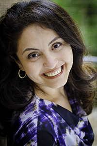
Katrin Azimi is a beautiful woman, but in this pose (above left), her blouse’s busy pattern is distracting. In the portrait on the right, Katrin has much more flattering lighting and she’s wearing a plain black dress, so the viewer’s focus is on her gorgeous eyes, not on what she’s wearing. If you have a striking eye color, say bright blue, that is brought out by wearing bright blue or gray, by all means, choose something that flatters you, but keep it simple in style.
Jewelry
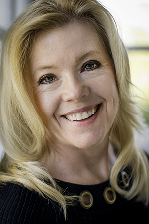
Avoid overly flashy, clunky, chunky jewelry. Remember, the photo is about you, not your bling. If you wear jewelry at all, it should suit your outift and lean toward understated and classic. eFrog author Judith Lown (left) is elegant in a black blouse and classic pearls.
On the other hand, I knew a children’s author several years ago–Paula Danziger – who was known for beautiful, colorful, long, flowy scarves wrapped around her head, Gypsy-style, and big, flashy, chunky jewelry. It was part of her persona and it suited her. If she’d followed my suggestions above, no one would have recognized her.
The key is that your clothing should enhance your image, not detract from it.
Posing
Sometimes when I’m wandering through the various social media sites and come across the photos people post of themselves, I wonder what in the world they were thinking. Those arm’s-length, uptilted self-portraits aren’t flattering to anyone. When you’re ready to have a professional portrait made, go with a photographer who has some experience in posing. There’s a trick to it based on body type, height, seeing which is your “best side”–everyone has one–and creating a jawline where maybe there isn’t one.
 Blogger Nancy McGeath’s profile image is sized correctly for use on Twitter, Facebook, and any other social media she wants to use. The lighting is good, the background and her clothing are simple, and the crop focuses the viewer’s attention on her face, where it should be.
For instance, I’ve taken several workshops on posing and I know how to lean you against a wall just so, tilt your head, swing your chin around to your shoulder, relax your hands here, adjust the lighting there, have you look straight into the camera and make an emotional connection and there, hold that, click. That’s the one. That’s the shot that will make your book cover and your website and the one all your Facebook Friends will be ooooing and ahhhhhing over.
The key here is to look natural and professional at the same time. If you’re nervous or self-conscious, the camera picks that up, so try to relax. Relax your mouth. Relax your hands. Relax your shoulders. Look into the lens and think about someone you love, someone who brings you joy, and click. That’s the one.
Setting
 Keep it simple. As with clothing, if the background of your image is too distracting, it will detract from your image rather than enhance it. Try to find a background that coordinates with your clothing and hair. You should look like you belong there, whether that’s in your living room or at the beach or in your garden or in the photographer’s studio. eFrog author Sandra Woffington looks beautiful and right at home, because she is. This portrait (left) was made in her living room.
eFrog co-authors Ann Carli and Mary Woods Scherr chose a beach setting for their portraits because their walks along the shore play an integral role in their book–Dear Ann, Dear Mary: A Correspondence of Grief and Friendship.
Makeup
Even if you never wear makeup, you really should consider wearing some for a portrait. It evens out your skin tone, lightens dark circles under your eyes, darkens eyelashes, hides blemishes, and for most people, can be flattering. You don’t need to go full-on America’s Next Top Model or anything, but a little foundation and mascara can save hours of Photoshop work later.
Hair
As tempting as it may be do something special with your hair, for a professional portrait, I recommend wearing it the way you normally would for any speaking engagement or media interview. People should be able to recognize you from your media photos.
The images you use for promotion shouldpresent you as friendly and approachable, confident, and professional. Keep your background, clothing, jewelry, and all else simple. Make sure the focus of the image is on you, not where you are or what you’re wearing. All of that is secondary to the professional author in the photo.
And remember, relax. That’s the key.
Please Share
Share your stories about author photographs. Have you had your photograph taken professionally? What were the results?


February 20th, 2013 at 4:30 pm
It’s amazing what a good photograph/er can do for a person, and Roxy is doing some amazing work. Now if only there were a program that would allow you to age your favorite photo so you had to have it done only once! Sorry Roxy, I know you want repeat customers.
February 20th, 2013 at 8:21 pm
Excellent tips Roxy! I love how you used photographs to get your points across. They also show what a wonderful photographer you are!
February 23rd, 2013 at 9:51 pm
Hey, Karen, I recommend updating your professional author photo at least once a year, and to be honest, you should have three or four poses from which to choose, depending on the editorial use. Give me a call if you want to set up a session!
Patricia, thank you! I work really hard to capture my subjects’ best aspect. I love working with creative professionals — they get the creative art involved here. It’s not just snapping a photo. We’re creating a piece of art together.